Overview
If a world-renowned tabla maestro's website doesn't match his artistic excellence, something needs to change. I took on the challenge of transforming Yogesh Samsi's text-heavy Wix-template looking site. The focus was serving his diverse audience - from concert organizers and music fans to aspiring tabla students. This wasn't just about making things look pretty. It was about creating clear pathways for different users to get exactly what they need, whether that's downloading press materials, checking upcoming performances, or signing up for masterclasses. Using Next.js and some smart design choices inspired by his imagery, I built a site that's already proving its worth with growing newsletter subscriptions and a much smoother experience for everyone involved. Here's how we went from information overload to intentional design.
The Client
Yogesh Samsi is a world renowned and unique tabla artist who has simultaneously scaled unprecedented heights of achievement in solo performance, accompaniment, and pedagogy.

The Challenge
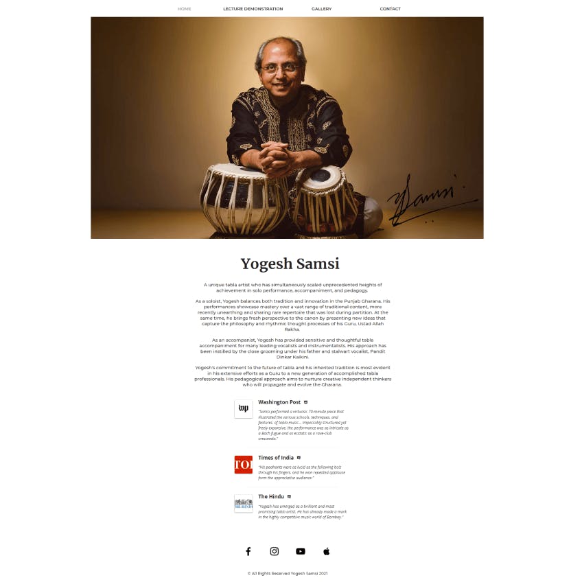
There was an increase in the interest in Yogesh Samsi's web presense, specially to inquire about lessons in tabla and his upcoming events. The original website was a quick and dirty Wix. It was not well laid out and very heavy on text. This made it very visually overstimulating and did not exibit a clear goal as a user.
The idea was to redesign the site to be more intentional. Lay out information aesthetically and functionally so that users are guided through the site efficiently. Here's the old site:
The Research
Upon discovery with the client, we found 3 main user flows in order of importance:
- Organisers need easy access to Yogesh Samsi's biodata and to download gallery images for use in the performance and publicity.
- Patrons and fans should have access to his Upcoming Events along with preliminary information and links to book tickets.
- Students should be able to register for his Online Masterclasses and get in contact with him.
The Approach
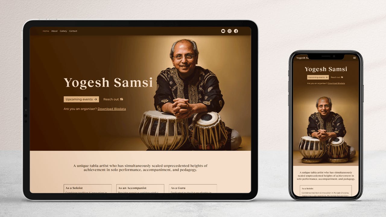
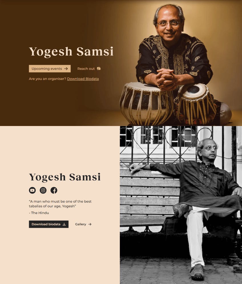
There was no predetermined branding, so the brand colors were adapted from the main feature image.
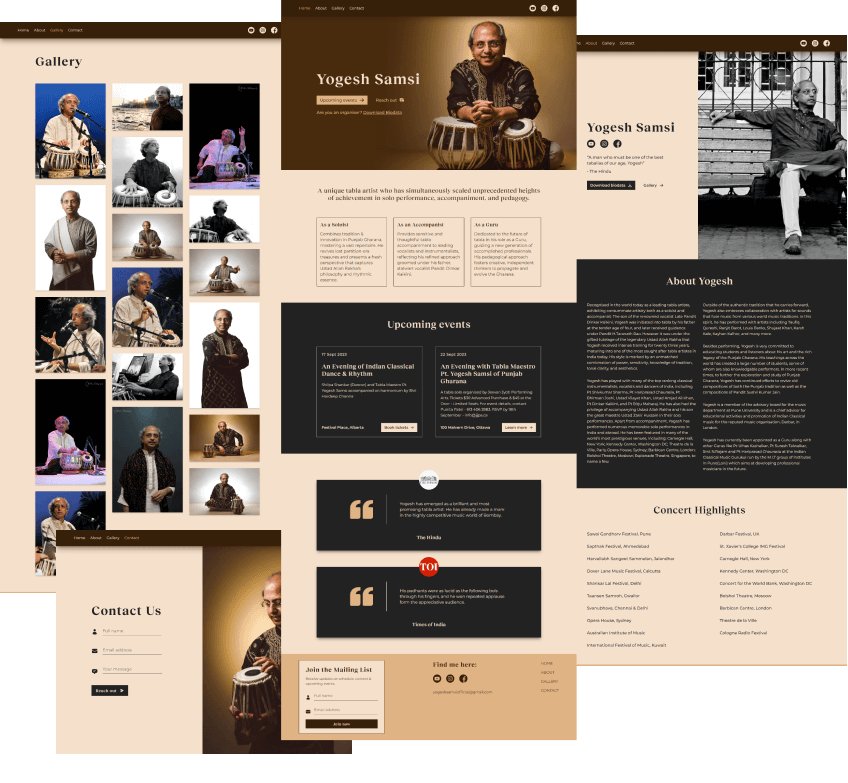
The main focus was on keeping textual information concise and laid out in readable sections that are easy to consume. We also put down clear paths for the flows above:
- The home page's main call to action links to the Upcoming events section on the page and the secondary call to action links to the Contact page. The tertiary call to action is directed towards Organisers. Since they are not a large chunk of users, there's a simple textual tertiary CTA for them that links to the About page.
- The about page's main call to action is to Download biodata. The secondary call to action is to visit the Gallery. This way as an organiser that's directed here, at a glance, you have the Biodata and Gallery available to you.
The Development
The website was completely custom coded. The tech stack was Next.js with Typescript and Tailwind CSS for styling. I also integrated Keystatic, a CMS that hooks into your local files, which gives maintainers of the site a seamless editing experience while keeping the development side simple for me without bringing in complexities like Databases. The full source code can be found on my GitHub repo - neeshsamsi/yogeshsamsi
The Conclusion & Final Product
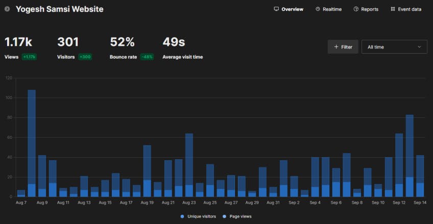
Since the launch of the website in mid August, we've seen 15 newsletter subscriptions in less than a month. And a significant increase in Contact Form submissions. The experience for organisers to access the information they're after is efficient.
